
2011年5月10日星期二
Fluid Identity
How many forms can one logo have? Some people would say “of course one”. But Fluid identity which is becoming popular these days will tell you no. fluid identity means logo systems that use multiple iterations of a mark (or series of marks) to communicate a particular aspect of a brand. These might take the form of a logo that changes with each viewing, or a singular mark that gets impregnated with different imagery, depending on the context. Moreover, new technology has applied in some fluid identity, which makes dynamic logos. The logos which animate from different colours, shapes and so on are put on the websites or other non-print media. Although the days of the static logo are certainly not extinct, this persistent way of thinking about malleable identities seems like a portend of things to come.
So I got some questions for this new type of visual identity and through examples to consider these questions.
1. what kind of company fluid identity should be considered
2. how to communicate a clearly company image through multiple expressive forms
3. how to interact with the audience using fluid identity
4. how to make the single pieces equal the whole identity
5. what kind of information the company want to communicate through fluid identity
1. Nordkyn
Great looking identity for Nordkyn, in northern Norway by Neue. Nordkyn is a peninsular dominated by the arctic weather, and this amorphous logo reflects that. The prism logo is animated to move in the direction of the winds, and changes colour with the temperature from -25ºC to 25ºC. It is a very simple concept that is executed beautifully.The idea came from a stylised snow flake, which represents the calm state (look at bottom left). The wind then blows this prism in the different directions.The logo then changes colour based ontemperatureExamples of the logo in different states of wind and temperature.

2.MIT media lab
The basic idea here is that the logo has three intersecting spotlights that can be organized in any of 40,000 shapes and 12 color combinations using a custom algorithm. That’s enough to supply each and every new card-carrying Media Labber with his very own logo for a whopping 25 years. Folks select a design on a web-based platform, and once they’ve made their choice, no one else can poach it; it’s as personal as a Social Security number.


3.AOL
People use AOL ostensibly as a search engine, to find all sorts of things, so this identity leverages that multiplicity with a wide variety of supporting images. Although the AOL logo itself will be constant, the backgrounds will change continuously in an effort to suggest the breadth of AOL’s content. Hundreds of backgrounds are ready to go, among them depictions of a fish, a skateboarder, a View-Master, a leaf, a lovable monster, a Polaroid camera, a high-heel shoe, a head-banging rocker and a kissing couple.
4. Casa da Música
This identity is based upon the shape of the Casa da Música in Portugal, the building designed by Rem Koolhaas.They created Casa da Musica logo generator. Based on content's color (e.g. a poster) the generator "calculates" the logos colors.

Reference:
The analysis paradigms of fluid logo
1. Colour
2. Symbol
3. Font
4. Except these elements that normal logo has, the most obvious feature of fluid logo is multiple variations of the form of logo.
From the examples, I can conclude that
1. All the fluid logos are all based on a big frame, and through the variation of colours, positions, shapes, and images to create an individual identity. So this is how the single pieces equal the whole identity.
2. Some logos are created to communicate the variety products or service
that the companies’ offer or the features of brand.
Ex: In the case of Nordkyn, with its arctic and rapidly-changing weather conditions, this is a distinctive and smart logo that connects the logo with Nordkyn which as a brand very well. The tagline – “Where Nature Rules” – is reflected directly in the execution of the logo and also expresses the main feature of the Nordkyn which is beautiful natural scene.
In the case of AOL, logos changing from variety supporting images to communicate that the company is a premier and pioneering Internet service provider.
In the case of MIT media lab, the logo’s varying nature what MIT media lab does.
3. Some fluid identity can interact with audience, which maybe is the trend for future branding development.
4. The fluid identity is more flexible to work on various freeing ways because its features.
5. New technology is applied in some fluid identity, which makes dynamic logos.
These kinds of logos help company to stand out, and it challenges the way we thinking of the branding. More important, it makes the brand have a certain emotional relationship with their audience, which is a trend for future branding. But for me, there alsois a question existing,
One of the criteria of a good logo is versatile, so I think some fluid logos cannot achieve this criteria, such as AOL logo, the logos are changing form different supporting images, I think it will not work very well when the logo is small.
How Coca-Cola adopts localization strategy from brand identity in China
Coca-Cola has become an indispensable part of American life. It packs “American Dream” in the bottle, which is a symbol of vitality, passion, creativity and optimism. It’s not only a choice of beverage for American people but also the expression of American spirit and a part of pop culture. Although Coca-Cola has witnessed every historical moment for America in 20 century and become an American cultural icon, at the same time, it is not only spreads and sells the American culture, but takes different strategies to meet the varied taste preferences of consumers everywhere. If coca-cola only limited on the expression of American culture for its marketing, it’s impossible for it to become a brand that can be recognized in the multicultural world. Such as the advertising slogan in American homeland is “can’t beat that feeling”, but in Australia it changed as “real taste”, “coca-cola is in the house” in Russia, “Whatever you wish will come true, enjoy Coca-Cola” in India, advertising slogans always reflect the local culture. When Coca-cola based on American culture connects with Chinese market, it is more difficult for its localization because there are huge differences between eastern and western culture. However, coca-cola finally found a cross-cultural brand marketing mode and put it on “Chinese red” successfully.
Coca-Cola localized in brand identity for china from the following visual aspects.
1. Logo
The Coca-Cola logo, like the product itself, is rated among the most recognized, classical logos and brands in the world. The original bright red and white colour scheme logo is the global unified visual identity of coca-cola. There are three core elements in the visual identity system of Coca-Cola which are broadly accepted by the customers all over the world.

1. The name of the brand, Coca-Cola.
It is this unique name that is remembered by the people from all over the world.
2. Standard colour:red.
Coca-Cola selected red for its standard colour, which is applied in the whole visual identity system, from the logo, employee uniform to the product packaging. As time passed, people associate red with coca-cola when they think of the colour.
3. Typeface with wavy ribbon patterns that make the whole logo vitality and dynamism (as picture 1 above shows).
The dynamic ribbon becomes part of an international graphic language that could be understood by everyone around the world.
All of these are the most valuable treasure and distinctive features of the coca-cola compared with other rivals. Thus, Chinese version logo should implement the continuity of VI concept and present new features while maintaining the brand's original image. That means the logo should not only represent the Chinese characteristics but also has correspondence with the existing visual identity system of coca-cola. Most important thing is Chinese logo must express the key values of the brand also.


First of all, the Chinese name of coca-cola: ke kou ke le
The approach of choosing Chinese name for coca-cola is the nearest pronunciation of English. Moreover the four characters have their own meanings which totally express the concept that coca-cola wants to spread.
可Ke: means permission, can, may.(Same pronunciation with “co”)
口Kou: means mouth(same pronunciation with “ca”)
可Ke: means permission, can, may (same pronunciation with “co”)
乐le: means happiness(same pronunciation with “la”)
The combination of the former two characters mean can eat, good to eat. The later two characters mean can be happy. So the Chinese name of coca-cola means delicious and happy. It is this name that is recognized as one of the most beautiful translation and brings luck and popularity to coca-cola.
Secondly, Coca-Cola Chinese logo design adopts a white on red (as picture 2 shows), which is the most prominent feature of Coca-Cola and also Coincides with traditional Chinese festival colour: red. In china, red has special meanings to Chinese people. It is a traditional popular festival colour which reflects happiness, prosperity,luck, celebration and the spiritual and material pursuits of Chinese people. Whether it was a stroke of luck, the red of coca-cola brings Chinese people familiarity and joyousness. At the same time, using the new Spencerian-style of Chinese typeface emphasized the lucidity of the logo and got perfect combination with its counterpart English version, to convey a contemporary look. Coca-Cola Chinese logo design continues applying wavy ribbon patterns which express the brand value of the company: Infinite possibilities, dynamism and vitality. Even though the Chinese characters are completely different from the English letters, both versions of the trademark today have a very similar and familiar appearance. From visual unity, customers can feel the integration of western and Chinese cultures directly.
2. Packaging
When Coca-Cola adopting a new packaging, it is a talking point for market and audience, not just the product itself but packaging design is also the highlight to attract all eyes. There are three main aspects that coca-cola integrates Chinese culture with packaging, which makes consumers identify its brand, feeling brand affinity without knowing. Coca-Cola’s localization on the packaging is reflected in following three aspects.
(1) Stars that Chinese young people like


(2) Chinese traditional culture


(3) Significant events for Chinese people


Understanding target audience is obviously significant for a brand. It’s necessarily for a brand to know the need that its target audience requires. Coca-cola recognized that consumers in different regions have different cultural backgrounds and preferences, especially in china, people desire for Auspicious, jollification and family psychologically. So the company pays more attention to the psychological needs of consumers rather than spread American culture only.

Coca-Cola advertisement in China changed its main popular character in local America“Santa Claus”(as picture 5 above shows)into two children wearing Chinese costume and also joined quite a lot of Chinese elements(as picture 6 shows above), focusing on the expression of the philosophy of family first and harmony. Moreover “Dragon”, “paper-cut”, “shadowgraph” and other symbols of Chinese culture often appear in the advertisement.


Over the years, coca-cola’s red is still very remarkable in the world. A lot of reasons contribute its success, but as one of most successful brand in the world’s brand marketing, the key elements of success are Cross-cultural communication, localization and insistent of brand value of itself. The mode Coca-Cola took is a kind of Non-aggressive cultural integration and successfully conquered the cross-cultural marketing
The process of creating typeface
I was interested in typeface design for a long time, especially, it's can be seen one part of logotype. So, in the AP2, I tried to design typeface to know the whole process.
1. Sketch the ideas on the paper, define the personality of the typeface that you want to creat. The inspiration of typeface that I created is from petals.

2. Scan the sketch into the Illustrator and make them carefully using pen tool.


3. Use photoshop to add more effects.

I also tried to creat some Chinese characters, although they are totally different, the process is the same.

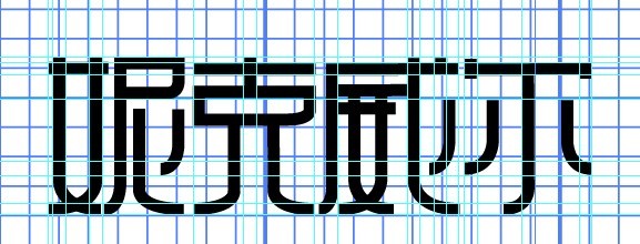


Through the comparison, I found because Chinese characters have more strokes and radicals, more attention should be paid on the structure.
Ku 6 dynamic logo
After the analysis the dynamic logo of Ku 6 in AP2. I think I should create a dynamic logo to reinforce the understanding and experience how new technology works in logo design.
Title: Dynamic logo for Ku 6.com
Overviw: Creat a dynamic logo which is placed on the website.
Background: Ku 6.com is a leading Internet television in China. Ku6.com has won the favor of hundreds of millions of netizens.Since its foundation, Ku6.com has always kept the pace of high-speed development. With video media as the platform, Ku6.com has pioneered in the differentiated video marketing mode and won favors from a number of clients with its innovated UGA video marketing advertisement mode and established a solid mutual partnership with them.
Brand Concept : Independent Opinion, Entertainment Spirit
Target audience: The people who watch the online television
Brand value: Aleading Internet television prodducing hi-quality and hi-speed moive and television
Tone of voice: Be creative
Be entertainment
Criteria: 1. The logo should be simple enough to work on the website
2. Do not use complicated technique to confuse the audience.
3. Like the normal logos, dynamic logo also should express the feature of the company
Learning Objective: To practice how new technology works in logo design
2011年5月6日星期五
logo for Chichago photography


1. communicate the image of the company
2. not only logotype
3. the logo should simple, modern, creative
From the sketches of the ideas, I picked 3 ideas that fit to the criteria. Actually, the second one is the simplified version for the first one. The former two ideas are a combination of camera and the capital letters "c" and "p". The third one adopts the frame aiming at objective when we take photos.
And finally, I picked the second one as the logo, because it's simple, modern, and can represent the feature of the company.
订阅:
博文 (Atom)