2011年2月15日星期二
2011年2月14日星期一
logo for beauty workshop
Sketches
Test
Title: a logo design for a beauty workshop
Background: the makeup workshop part is to be underneath" the beauty palette". it is for essentially a workshop that is hosted at some nice location, for about 20 ladies. we will have 'goody' bags where there will be a few items given by sponsor companies(the list isn't available right now/yet). the workshop covers makeup.application techniques(ranging from neutrals to glamour), personalized colour scheme and makeup makeovers.
Objective:teach some ladies makeup and application techniques and help them to achieve the dream of beauty.
Brand value: the beauty palette is a private beauty workshop that covers makeup, application techniques, personal colour scheme and makeup makeovers.
Target audience: 25-40 years old ladies who are not got at makeup and have the dream of beauty
Mandatory inclusions: the logo will be on the marketing materials, advertising flyers/web ads etc...so it has to make a real impact and be eye catching
Deliverable:
1.300*300 pixel
2. easy to spread on different medium such as,flat,three-dimensional,and electronic media
learning objective: for this brief, i will focus on choosing colour for logo according to the industry of the company to learn how colour is adopted in logo design
Criteria:the brief is asking to design a logo for a beauty workshop especially for women, so the logo should 1. communicate characteristic of women(feminine)
2. colour should not be adopted by some dark and cold colour
Brainstorming:
The brief asked to design a logo for a beauty workshop called beauty palette. So I wanted a symbol representing feminine. Finally, I chose the butterfly, which because every girl has a dream to become beautiful.
And I thought the challenge was to create a distinctive symbol compared with other logos using butterfly.
logos for a software for dentists
Title: A logo design for denteasy
Overview: The purpose of this brief is to create a logo for a software for dentists.
Background: we are young web successful company from Italy, we make web applications and software, informatic systems and consulting.
Objective: The name is denteasy, where "easy" is the easy network ( our company) suffix. We have the idea of a logo similar to a peacock or melted logo between dental software called denteasy and the word peacock, but you are free for all suggestions.
Brand value: The company is a technology company which makes web application and software, informatic systems and consulting.
Target audience: we want to sell a web app for dentists who want a new kind of app for organize their job. Mostly young dentists or hi- technological oriented.
Mandatory Inclusions: The software have a web interface Apple like so, the logo, must be in according to a smooth design young and easy(simple)
The company is to sell a web app for densists who want a new kind of app for organize their job. And I think the symbol should communicate both features of Hi-tech and dentists. So I tried to find some relationship between dentists and software to creat a simple symbol represesnting company and finally got these two versions of logo.
Professional practice 1 work
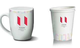
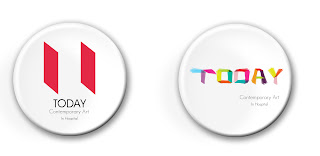
This is a brief of DAD, which asked to design a brand for an art gallery in hospitals.And we worked for professional practice course. From the brief, I wanted to design a symbol to represent contemporary art. So, I did some research on comtemporary art and found the most feature of its artistic forms compared with other arts is not only oil paintings on the all, it also has installations, sculptures and so on. so, the glass boxes used by contemporary artists came upon me.(as picture followed)

So, I thought maybe this can be used to creat a graphic to represent contemporary art.
As for name, I wanted a name can represent the content of the gallery, so I came up with the word"today". The same meaning of word contemporary(except word classes). And I think it can tell audience the theme of the gallery, it's about something happens now, not past, not future.
And I also put the logo on different mediums to text.
订阅:
博文 (Atom)


